RTH Solutions
Brand identity for a newly established visual services business
Industry
Visual services / aerial media
Brief
Create a confident brand identity from scratch
Deliverables
Logo suite • colour palette • visual direction • Brochure
Outcome
Cohesive brand rolled out across web, print & social


About the project
RTH Solutions approached me at the very beginning of their journey. As a newly established business offering aerial and visual services, they had big ambitions but no existing brand identity in place.
They were looking for a professional, considered brand that would help them stand confidently alongside more established competitors, while still reflecting their creativity and technical expertise.
The Brief
The aim was to create a brand identity that felt professional, credible and distinctive, while remaining flexible enough to grow with the business.
It was important that the branding worked seamlessly across digital platforms, print materials and future marketing, giving the business a clear and confident visual presence from the outset.


Design Approach
I worked closely with RTH Solutions to understand their vision, values and long-term goals. From there, I developed a visual identity that balanced technical precision with creativity - ensuring the brand felt trustworthy, confident and well considered.
The identity was designed to be flexible in use, with a logo suite, colour palette and supporting elements that could be applied consistently across all touchpoints.
The Outcome
RTH Solutions now has a clear, cohesive brand identity that reflects both their professionalism and creative offering. The branding has been rolled out across their website, business cards and social media, helping them present themselves confidently as the business continues to grow.
Client
Feedback
"Lauren did an incredible job designing the RTH Solutions logo and brand guidelines, which included fonts, colour palettes, and logos. Her attention to detail and commitment to understanding our brand from the outset added a personal touch that few individuals or companies consider. Lauren makes every business feel unique and captured our brand’s essence in ways I hadn’t imagined possible.
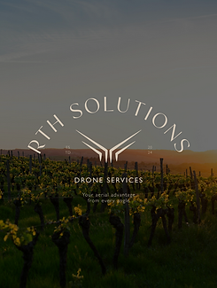
The primary logo she created, featuring “RTH Solutions” along with our tagline, “Your aerial advantage from every angle”, serves as the cornerstone of our visual identity. Its versatility across applications—from business cards to our website header—has been invaluable. She also provided streamlined versions, including a secondary logo and minimalist brand mark, ensuring brand recognition across all platforms, even in smaller formats like social media profiles and promotional items.
Lauren’s choice of an earthy and professional colour palette—including tones like Moss, Coffee, and Autumn—captures the spirit of RTH Solutions by blending grounded sophistication with vibrancy. Each colour was chosen with intention, from Moss for stability to Autumn for creativity, establishing a modern, trustworthy image that resonates with our target clients in agriculture, real estate, and environmental sectors.
I was genuinely impressed by her incredibly quick turnaround time, especially considering her busy schedule with a range of clients. Her dedication to quality never wavered, showing our project was always a priority. We’ve already recommended Lauren to others, and they, too, were impressed by her skill and talent—they’ve gone on to book her services themselves!
RTH Solutions has already lined up more projects with Lauren, and we’re excited to continue this partnership well into the future. As a new start-up, we cannot thank you enough, Lauren; you’ve already given us the professional, world-class image we need to compete with established industry players. Thank you, Lauren—we can’t wait to see what you create next!"


