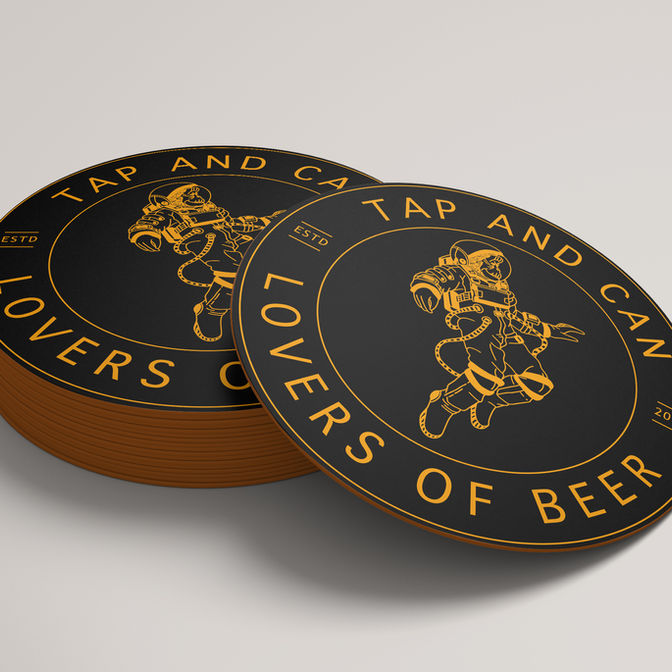
Tap & Can
Bold, character-led branding and website design for an independent craft beer bar in Shrewsbury.
Industry
Hospitality, Craft Beer Bar | Shrewsbury
Brief
To rebrand an established independent craft beer bar, creating a bolder, more confident visual identity, website and branded merchandise that better reflected the venue’s personality, ethos and community-driven approach.
Deliverables
Brand identity • logo suite • colour palette • typography • illustration & iconography • brand strategy • supporting brand assets • branded merchandise design • website design & build
Outcome
A confident, character-led rebrand that strengthened Tap & Can’s presence both on the high street and online, supported by a flexible visual system that translates seamlessly across signage, menus, merch and digital platforms.

About the project
Tap & Can opened its doors in 2019 as an independent craft beer bar in Shrewsbury, built around a love of quality beer and bringing people together. Over time, the business developed a strong local following, but the existing branding no longer fully reflected the personality, atmosphere or ambition of the bar.
In 2023, Tap & Can decided it was time to refresh the brand - not to reinvent who they were, but to create an identity that felt more confident, cohesive and expressive across every touchpoint.
The Brief
The aim of the rebrand was to create a visual identity that felt:
-
Bold and confident
-
Inclusive and social
-
Full of character without feeling chaotic
-
Flexible enough to work across physical and digital spaces
Alongside core branding and a new website, the team also wanted the identity to translate effortlessly onto branded merchandise, including T-shirts, hoodies and beanies - pieces that could be worn by staff and customers alike, and feel like a natural extension of the brand.

Brand Direction & Strategy
We began by revisiting the heart of the Tap & Can brand — its ethos of community, quality over quantity, and shared social experiences.
Rather than following trends, the focus was on creating a character-led identity that felt authentic to the bar and its audience. Illustration became a key part of the visual language, allowing the brand to feel expressive and recognisable, while strong typography and a confident colour palette ensured it stood out in a busy hospitality landscape.
The branding was intentionally designed to work just as well on merchandise as it does on signage and menus — bold, recognisable and wearable.
Visual Identity
The rebrand introduced a bold and distinctive visual system designed to feel lively, welcoming and unmistakably Tap & Can.
A flexible logo suite was created alongside a strong colour palette and custom illustration elements. These components work together across:
-
signage and menus
-
packaging and printed materials
-
branded merchandise such as T-shirts, hoodies and beanies
The result is a brand that feels confident and cohesive, while remaining adaptable to different formats and scales.
Website Design
Alongside the rebrand, I designed and built a new website to bring the refreshed identity to life online.
The website is clean and intuitive, allowing the branding and imagery to take centre stage. It provides space for updates, events and future growth, while remaining simple to navigate and easy for the team to manage.


